Are you sharing your products on Pinterest and seeing conversions? If you’re already seeing success selling things on Pinterest I bet you’re brainstorming ways to get even more from this channel.
Why You Should Be Selling on Pinterest
People are using Pinterest to discover things to buy. From shoes to kitchen appliances (and everything in between). Meal kit delivery? Yep. Rugs for their living room? Definitely. Bows for their baby’s hair? You bet. So, it only makes sense that anyone with an e-commerce site is focusing on selling on Pinterest. Here are some more facts:
- 85% of Pinners are planning projects
- 75% of Pinners are always shopping
- 97% of searches are unbranded (This means opportunity for YOUR brand to meet them right in the beginning of their purchase decision journey)
- Pinterest active users have higher incomes than those on other channels
- Pinners have 85% Bigger baskets than other social platforms
- Pinners claim to be 7x more influenced by Pinterest when it comes to making a purchase
The Key to Selling Things on Pinterest
The “secret” to successfully selling on Pinterest is to use common sense marketing and design tactics. Let’s walk through them:
Focus on Compelling Pin Designs With Powerful Landing Page Experiences
If you’re looking for ways to test more content on Pinterest that converts to sales, then test these Pin and landing page combinations to see if you can accelerate your growth on the channel. I wouldn’t be a Pinterest expert if I didn’t urge you to test, learn, tweak, and then test some more. You’ll want to look at your Pinterest stats to see what type on content is performing best (and take a deep dive into the new Pinterest trend tool to see what your audience is looking for). But, more importantly, you’ll want to look at your website’s stats to see what’s getting the most traffic and highest conversion rate.These ideas apply to organic Pins and Pins you plan on running as ads, too.
3 Ways to Design Pins When Selling Products with Examples
Let’s look at three different ways you can design Pins, and three different landing experiences you can give a Pinner once they click. Be mindful that if you include a call-to-action (CTA) on your Pin design, it should reflect your landing experience. (No bait-and-switch tactics!) A good ad delivers it’s promise after the click.
See examples below.
1. Selling on Pinterest with a Product Pin → Product Page
This is the most obvious way to showcase your product on Pinterest, but the challenge here is to get creative. Don’t be lazy and Pin a sku photo on a white background. Your goal is to design a Pin that stops someone’s scroll and piques their interest. I’ve talked about designing compelling Pinterest creatives in the past (be sure to read my 3 tips if you haven’t already) and it’s worth reminding you that effort matters here. Use product imagery that is more lifestyle vs stock, shows your product in use, or shows different angles of it. If you don’t have photography resources, consider utilizing influencer content (with permission of course) when creating your Pin. Then, have that Pin link to the product page where it can be purchased.
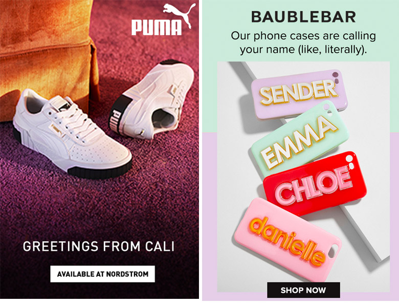
- Pin 1: This would link directly to a purchase page for these shoes
- Pin 2: This would link directly to a purchase page for personalized phone cases
Possible CTA’s for single product pins: Shop Now, Purchase, Download, Get it Now, Try Now
2. Selling on Pinterest with a Product Pin → Collection or Category Page
In most cases, sending ads to a collection page vs. a single product page will convert better. Pinners are in scrolling mode and if you keep them browsing on your website, they’re likely to discover something they want.
Have you found this to be true? If this works best for you on other channels, it will likely hold true for Pinterest. Design a Pin showcasing a few different products that are all a part of a collection on your site. Having several products on a Pin means you’re more likely to appeal to more people. Then, link that Pin to the appropriate collection on your site. Just be sure that the products shown in the Pin are on the first page of results (ideally above the fold) so people can quickly find the product from the Pin that interested them. Get creative here, you might even want to create a new collection page to test out this idea!
Remember: Pinners are in browsing mode so they’ll likely continue scrolling and browsing once they land on your collection page.
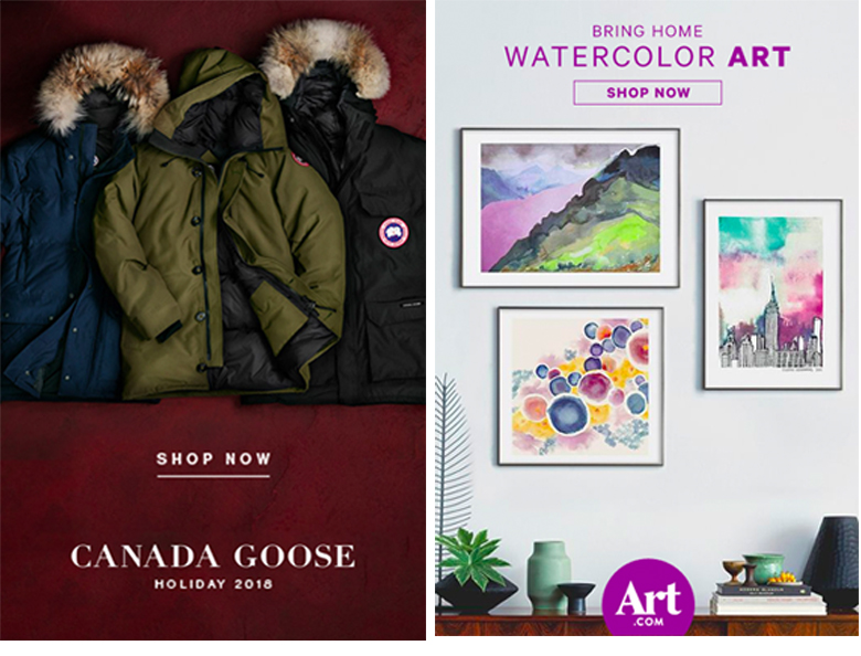
- Pin 1: This would lead to a collection of products in their Holiday 2018 collection
- Pin 2: This would lead to a collection of featured water color art
Possible CTA’s for collection pins: Shop Collection, Discover Gifts, Browse Styles, Shop All, See More
3. Selling on Pinterest with an Editorial Pin → Content/Blog
Since many people on Pinterest are looking for solutions, inspiration, and tutorials, Pins that have a more editorial tone often perform well. Explore what topics you might have that naturally relate to your product(s) and create content around that. A blog post can work well for this type of content. Just be sure that you make it easy for a person to purchase your product from this content once they’ve read it. Hyper link to the product pages or use a template or widget that allows you to embed the products into the content–often called shop-able content.
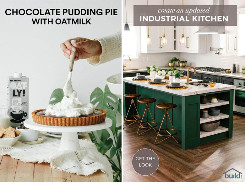
- Pin 1: This would lead to a page or blog post that showcases the product (Oatmilk) in a recipe. You would be able to then navigate to the product page to make a purchase or to a store locator widget.
- Pin 2: This would link to a blog post on site that shows this kitchen in more depth tour (or before/after) and then links to all the products featured in the photo.
Possible CTA’s for content pins with products: Get Recipe, Get the Look, See Tutorial, Explore Room, Learn More.
What Is A Good Click Through Rate On Pinterest?
If you’re running Pinterest ads and wondering if your click through rate is good or not, you’re not alone. While Pinterest will tell you that the average click through rate on Pinterest seems to be slightly different in each industry, I haven’t really noticed that to be true. I have managed campaigns for brands in the food and beverage industry, fashion, home, and gift space. Your Pinterest account manager will tell you that in the home space, the average click through rate is about 1.5%. I’ve easily met this across all verticals. And typically far exceed that (often hitting a 5-6% CTR). Here’s a look at current campaigns running in the home/textile space:

How To Improve Your Click Through Rate (CTR) on Pinterest Ads
If you see the CTR on your Pinterest ads falling, it’s time to test new creative. I don’t let my ads get below a 1% CTR. I’ll pause those ad creatives and launch new ones. Let any new ad run for 7-10 days before making any changes. Often, if you’ve added a new creative to an existing ad group it will take time for the new ad creative to see any traction. Don’t pause it before it has a chance!
Why CTR is Only Half The Story of Pinterest Ad Success
You’ve got an arsenal of Pinterest ads to test and you’re monitoring your click through rate, but of course when it comes to running successful advertising campaigns, that’s only half of it. You’ll be keeping a close eye on your ROAS (return on ad spend) to make sure your campaigns are meeting business objectives and hitting your target advertising goals.
An ad with a high CTR that does not result in any sales is NOT HELPFUL. Once your campaigns are hitting your target ROAS, then you can really dial in that CTR optimization.
The point here is that there is more than one way to design a Pin when selling on Pinterest and you can (and should) test to see what works best for you.
Looking for even more tips with examples? My Pinterest course includes 100+ real Pin design examples. Learn more here.
FREEBIE: Grab my 3 Pro Tips for Creating Pinterest Images
*All Pin examples are Pinterest ads designed by me, Tori Tait, in my role as a contractor with Pinterest. Do not use without permission.
