I’ve designed thousands of Pinterest creatives over the years. In fact, I’ve designed thousands of Pinterest Ads (or Promoted Pins) in the last few years alone–for all types of brands. So, when it comes to creative strategies for designing Pins that get attention in the feed and entice a Pinner to click, I’ve tested a lot of things and have discovered some best practices that will help you when you’re designing your own Pins.
Beyond sticking to the ideal Pinterest image size, here are a couple basic creative strategies that you will want to incorporate into your future Pins–organic and definitely for those you want to advertise.
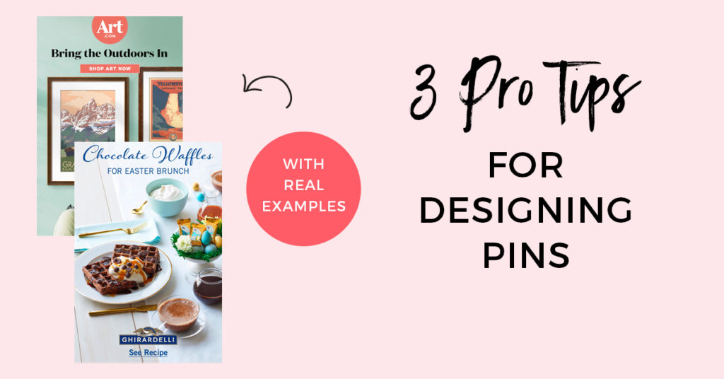
1. Be sure your subject is large, clear, and obvious. Pinners are scanning at lighting speed when they’re scrolling their feed so if your Pinterest creative doesn’t clearly and obviously show what your content is about, it’s going to get skimmed right over. Make sure your subject (person, product, recipe, etc) is large and takes up the most space in your creative. Make sure it’s clear and in focus (no low-res imagery!) so that it’s the star of the Pin. Lastly, make sure it’s clear what you’re focusing on. If it’s a food product, make sure it doesn’t get lost in a recipe or tablescape. If it’s a bracelet, make sure it doesn’t get lost in an outfit, etc.
Here are some examples from past Pins I’ve designed:
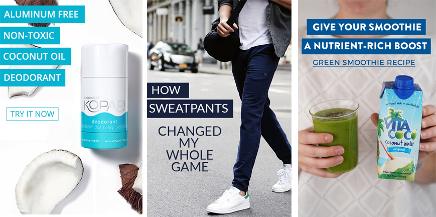
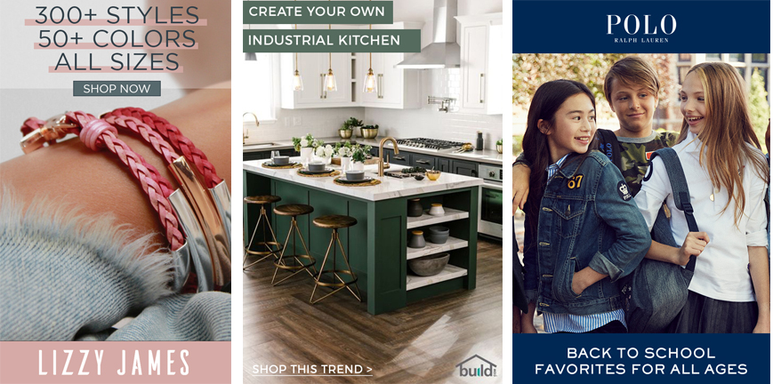
2. Use compelling copy to entice Pinners to click on your Pin. Think of adding a text overlay as the one-two punch in your creative strategy. Your image is going to get Pinners’ attention, but your copy is going to seal the deal (aka get them to click). Test different types of text overlay that best complement your image. This might be bullet points, a teaser sentence, or even customer testimonial. There’s a lot you can do here. One thing to keep in mind is size and length. Most Pinners are on mobile which means smaller screens, and smaller images. If your font is small and lengthly, it is not going to read well on a mobile device. Keep it short and big when possible.
Here are some examples from past Pins I’ve designed:
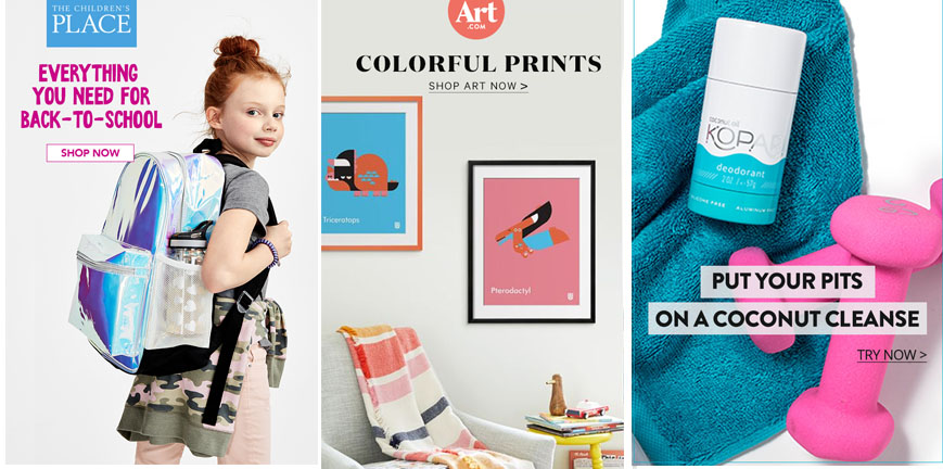
3. Incorporate Calls-To-Actions in your design. Using a CTA in your Pin creative makes it clear to the Pinner what action you are asking them to take. This is especially important for Promoted Pins since they are now all One-Tap (more on how to be successful with One-Tap Promoted Pins, here). Test different copy and designs for your CTA’s within your Pinterest creatives. Shop Now, Make It, See How, Browse Styles, Discover More, Order Now, Learn More, and Shop Style are all commonly used CTAs.
Here are some examples from past Pins I’ve designed:
As with any good creative strategy, the key is to test, tweak, and test again. Start to pay attention to what types of images, copy, and CTAs get the most traction. You might be surprised! Have fun experimenting with your Pinterest creatives! And, if you’re selling on Pinterest, be sure to take a look at these 3 ways you can design your Pins so that they lead to a checkout.
Want even more tips? Click below for 3 additional Pro Tips that will help you up your Pinterest game!
*All Pins shared as examples were designed by me, Tori Tait, in my role as a contract designer for Pinterest. See more examples here.

